UX Design for Developers: 5 Things to know to get started
Many software developers seem to be a little hesitant to work in the area of UX for career improvement. It isn’t as difficult as we often think it is – mostly all we need is some guidance to get started. Let’s explore 5 things that you must know before diving into UX design. These are:
Change Mindset From Developer to UX Designer
As a software developer, we often consider things from a technical point of view, but in order to start work in this area, we have to learn to stand in the user’s shoes. Developers have more concerns on whether the features are technically achievable or not and the effort needed to develop the features, which results in restricting ourselves to offer features that are within our current ability and scope of knowledge only.
To become a UX designer, we should always place the users in the center of our design. Some requirements from users might sound painful to developers like us, however, we should still take it into consideration if we want to improve the user experience of our product. It is much more meaningful for us to spend more time developing something the users truly need, instead of additional features that we assume users will need but in reality they don’t really matter to the users.
We might wonder, are the developer’s assumptions always incorrect and unreliable? The answer is a No. Sometimes users themselves might not know that they can have a better and easier way to perform their tasks since they are too used to doing it manually, this is where the developer’s assumptions can help. One of the keys of UX design is to find the balance between “what we think the users need” and “what the users actually need”. There is no harm in making assumptions, but make sure to verify them with the users.
Understand the Core of UX Design
The most common phrase that we hear from software developers regarding design is, “I can’t do UX design because I am not creative at all”. However, the core of design isn’t all about creativity or aesthetics, it’s about empathizing. UX design focuses more on how to help users complete their tasks in the simplest way.
In UX design, most of the time we are dealing with the flow or navigation from one screen to another in order to show what steps a user should go through to complete a task within our product. We can use simple shapes to indicate the elements on a screen, which doesn’t require professional drawing skills. How simple can it be? The image below illustrates some of the elements that are widely used during early stages of UX design.

Simple shapes used to indicate screen elements during the early stage of UX design
UI design focuses more on the appearance and aesthetics of the screen elements which commonly includes typography, colors and more. However, a good UI does not always equate to a good UX. A product can have excellent visual but poor user experience, this scenario often happens when a product focuses solely on making the screen looks good but hides away some important elements that are frequently used by the users, making it inconvenient to use.
However, this doesn’t mean that one is more important than the other. They are similarly important because a better looking product can always help attract more users, while a good user experience helps to retain the users. Though both are equally important, creativity shouldn’t stop us from designing for a good UX, generally the UX designer is not necessary to be the same who is responsible for the UI.
Create Your UX Design Process
The UX design process isn’t a new topic, there are a lot of well known and commonly used processes available to bring us a step forward in UX design. Unfortunately, sometimes a small company or a startup company without much resources can’t afford to follow the complete UX design process strictly, what we can do is to scale down the process according to the resources we have.
The most popular UX design process being used is as the illustration below, which usually consist of 7 phases.
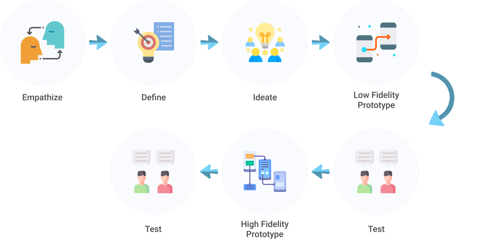
The most common UX design process being used by UX designers
For small teams or startups that don’t have much resources, it is normal that we can’t afford to go through this process completely. Hence, by using this design process as a base, we can scale down and define a process that suits our capability. The illustration below shows the example of a process being used in Soft-Skills. You might wonder why in our team, the Empathize and Define phase are omitted. Even though these phases are not listed as part of the UX design process, it doesn’t mean it is not executed at all. These phases will be executed by everyone in the team, and it is not specifically the UX designer’s job in our case. Since we are a small team, everyone is allowed to raise opinions, point out user pain points and gather insights together before we move on to the first phase.
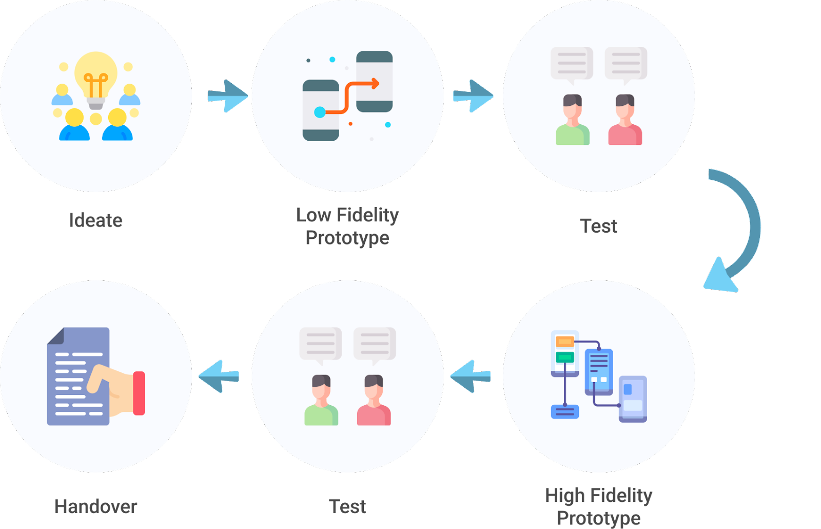
UX design process being used in Soft Skills
Now let’s dive into each phase to understand more. First of all we will start the process with the Ideate phase. In this phase, we should come out with as many ideas as possible without worrying whether it is technically achievable or not. We should not restrict our ideas within our current ability as brilliant features often come from the craziest idea.
After the ideate phase, we can pick and choose the most appropriate solution and turn them into a low fidelity prototype. A low fidelity prototype is a simple interactive flow of our design, it can demonstrate the brief navigation from one screen to another of our product during the early stage of design. It often connects screens of wireframes (simple versions of screens for our product that are drawn using basic shapes) to demonstrate the user flow. By developing a low fidelity prototype and testing it with the users or stakeholders, allows us to realize which part of the flow needs to be improved and iterate through our design quickly because we are not spending too much time on the visual.
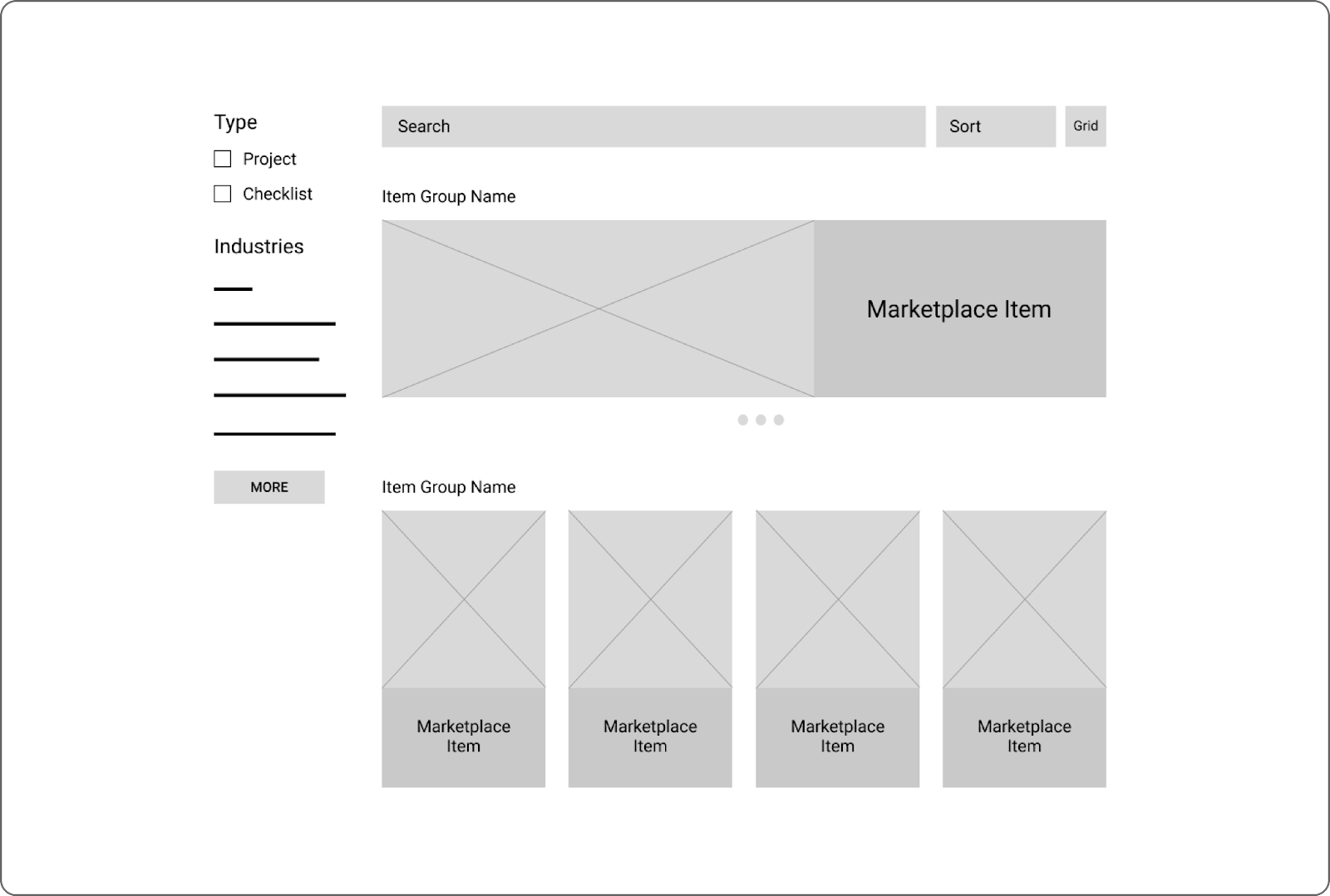
Snippet of a wireframe for a web application
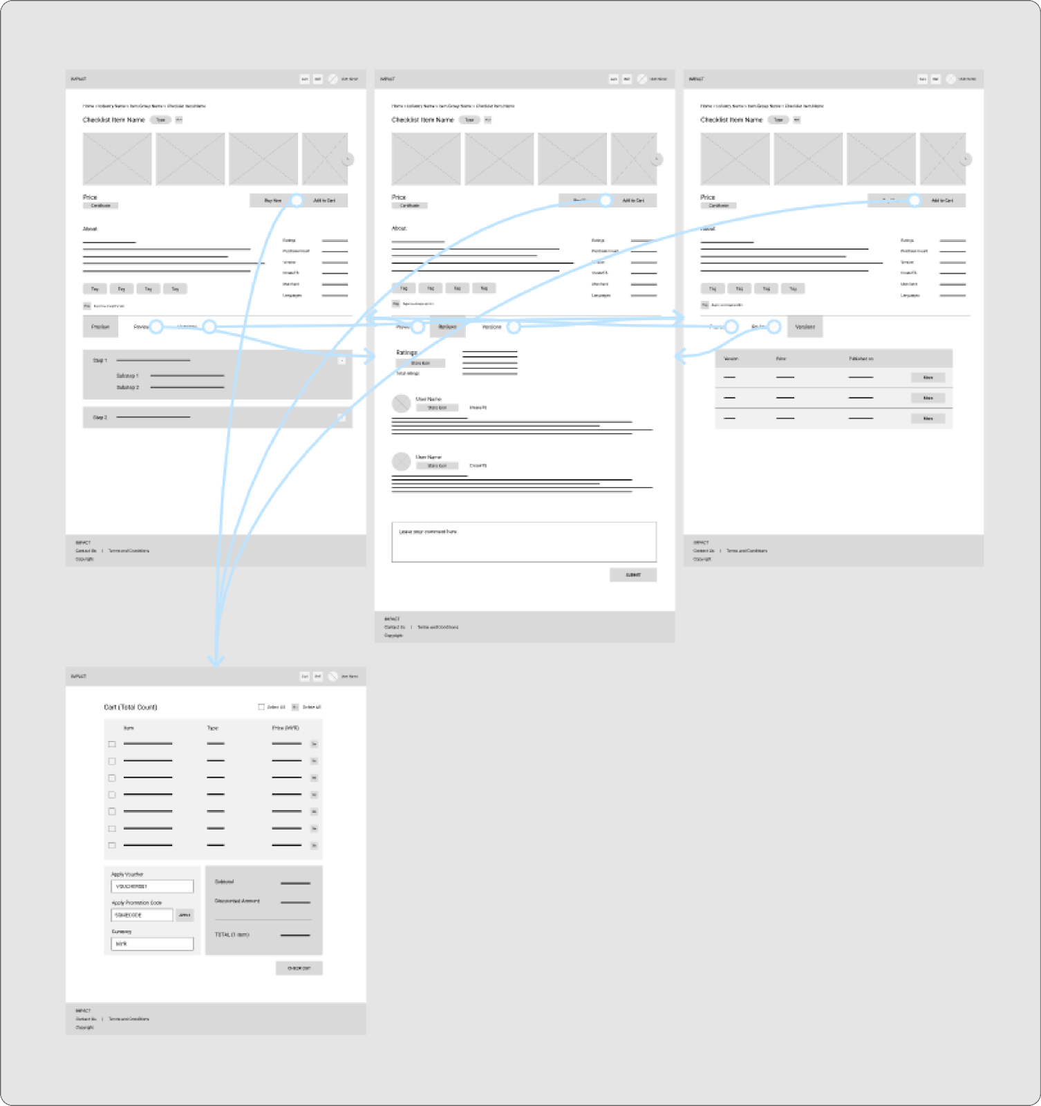
Low fidelity prototypes connect wireframes to demonstrate the user flow in the product
The next thing to do after testing and iterating our low fidelity prototype, is to transform it into a high fidelity prototype. High fidelity prototype is also an interactive flow of our design, but with detailed visuals that should look similar to the final product. Instead of wireframes, high fidelity prototypes will connect screens of mockups (screens that represent the final product) to demonstrate the user flow in the final product. We are able to know whether our design is good to go for development by testing our high fidelity prototype with our users and stakeholders.
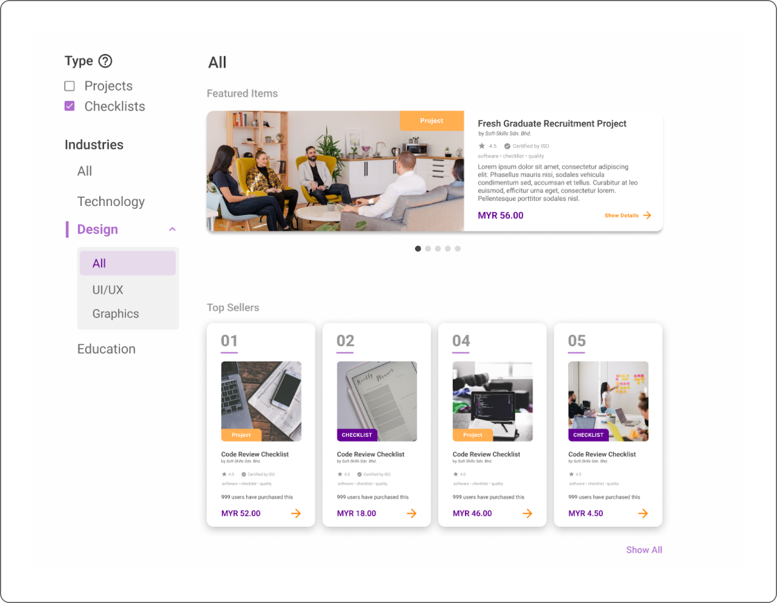
Snippet of a mockup for a web application
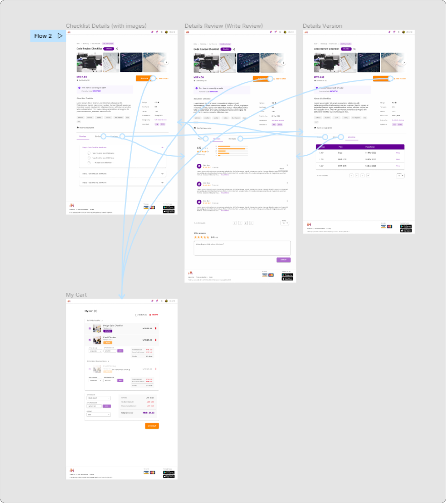
High fidelity prototypes connect mockups to demonstrate the user flow in the final product
Lastly, when the high fidelity prototype is firm and ready for development, it’s time for the handover phase. In this phase, all the special requirements and logics are documented clearly and handed over to the UI engineer to bring the design to life.
Useful Principles for Better Design
There are various principles that we can use to enhance our design, Gestalt Principle is one of the most useful principles that can help us organize contents in our design in a way that it is easy to understand by the users. Gestalt principles consist of 7 laws that can guide us to a better design, but in this section, only 4 laws will be demonstrated.
The similarity law in the Gestalt Principle states that we as humans tend to group elements together when they possess a certain level of similarities. One of the implementations of this law is demonstrated in the design below where the selectable elements are in the similar color, users will naturally assume that the elements in this color are selectable once they find out one of them can do so.
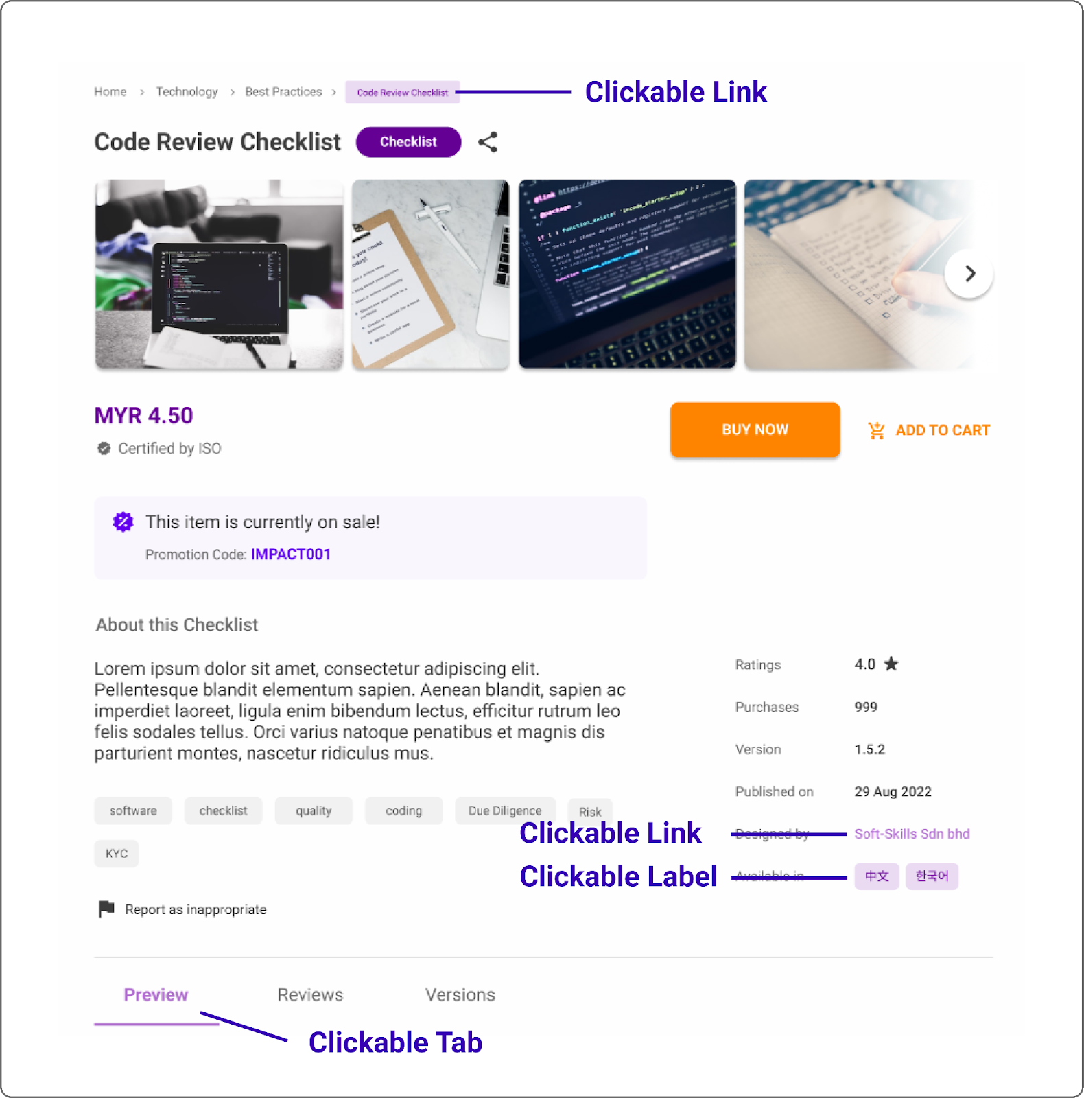
Use the same color for the selectable or clickable elements to serve as a hint to the users
Proximity law states that we tend to assume elements that are arranged closer together are related. This law has been widely used in almost all websites or mobile apps that we use daily such as Spotify, Youtube etc. Users are more likely to group the items together if the items are arranged closely together under a single title.
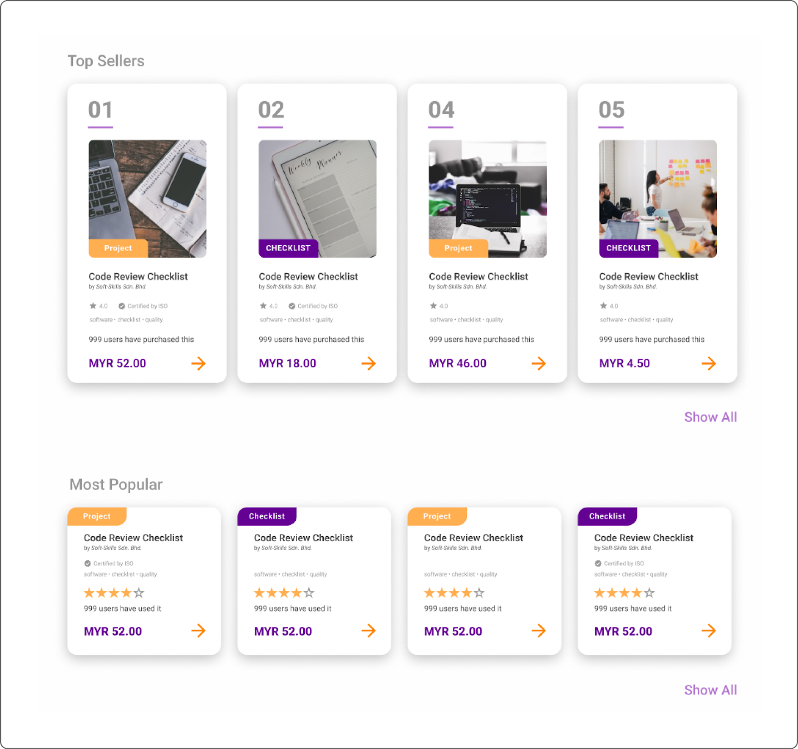
The bigger white space between the two rows helps us to assume that these 2 rows are in the different group
Subsequently, the Gestalt Principle also introduces the common region law which claims that when elements are enclosed within a certain region, we will perceive them as a group. When users see a few pieces of information are being enclosed within a border or card, they will know the images, texts and icons and more are referring and describing the same item.

The card encloses the information that is related to the same item
The fourth rule in the Gestalt Principle is the law of continuity. This law says that elements that are arranged in a line appear to be more related to each other than elements that are not. Refer to the example illustration below, the sub categories are slightly indented, hence, we will naturally assume that the indented items are not in the same level with the one that are not indented.
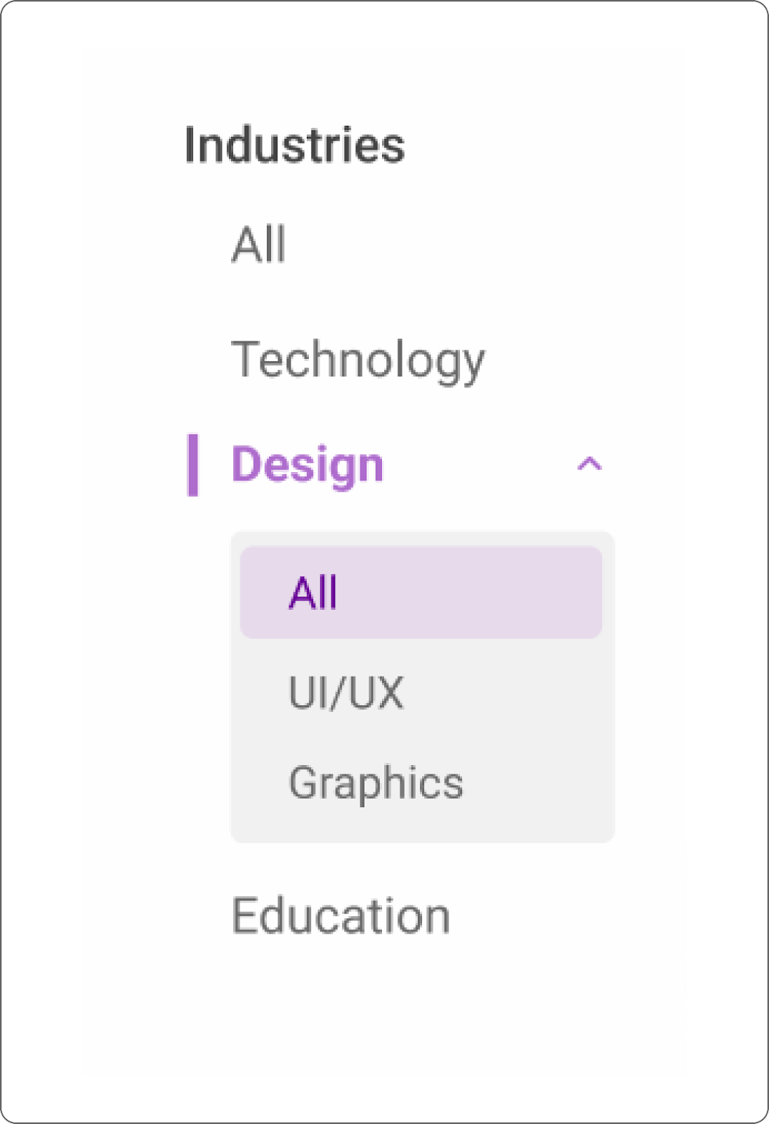
Main categories are aligned without indentation while sub categories are all indented
Things to Be Aware Of
As a UX designer, we should always strive to give our best to users. To further improve our design, we should also consider accessibility and avoid deceptive patterns. Accessibility certainly is a big topic and requires tons of effort to achieve it. One might think that accessibility is an overhead consideration for a small company with limited resources, but we should start small, instead of omitting it. While deceptive patterns are unethical, we should always avoid it to maintain our reputation.
For a quick introduction, accessibility allows users of different abilities, races, gender or age to use, enjoy and understand our product. In order to achieve good accessibility, it requires a lot of time and effort. Although we can’t provide full accessibility, we can still take some simple steps that are affordable for startups or small teams to enhance the accessibility in our product.
One of the simple steps we can take is to make sure that the text color and background color used in our product meets the standard of W3C Web Accessibility Initiative (WAI). There are a lot of tools available for us to check the contrast ratio of our text color and background color. WebAIM: Contrast Checker is a simple and easy tool to use for this checking, by ensuring the contrast ratio meets the standard of at least 4.5:1, it will greatly increase the readability of the content in our product by users who have poor eyesight.
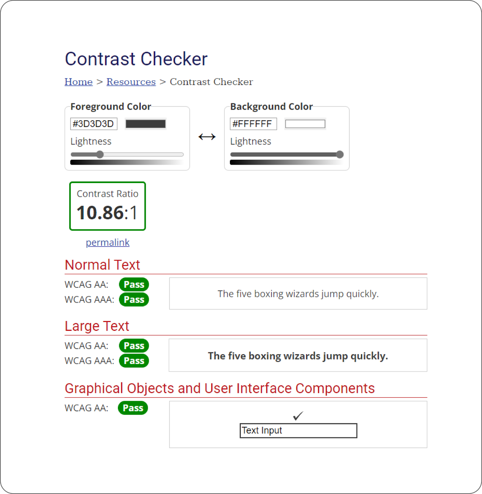
Use a contrast checker to check if the text color has a contrast ratio of at least 4.5:1 to the background color
The next step we can take to further improve accessibility is to add supporting text for colors or icons that might have ambiguous meaning. This small step can help users that can’t differentiate colors clearly or users who do not understand the icon to know what we are trying to tell them.
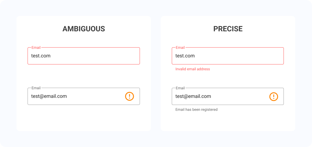
Add supporting text or visual to explain icons or colors with ambiguous meaning
Last but not least, we can structure our layout by importance following the pattern that our target users usually read, so that the users will know what content to focus on once they have landed on our product. In addition, by planning our content hierarchy carefully and group related information together, we can help users who are using screen readers to better understand the content in our product just by listening to the text in order.
As a UX designer we should try our best to avoid using deceptive patterns. Deceptive patterns are UX methods that are used to trick users to perform some actions they are not intended to. There are a lot of different deceptive patterns that we can easily find online, or probably being tricked by them before. This site Deceptive Design – user interfaces crafted to trick you is a good reference to learn more about deceptive patterns.
Undeniably, deceptive patterns do help to increase the company’s profit and some companies might declare it as their “marketing strategy”. Nevertheless, we should strive to be more honest to the users so that they won’t leave us and we can retain our reputation as well. UX designers often need to think of a design that can satisfy the stakeholders’ requirements and will not let the users feel uncomfortable. There will be no perfect solutions that can satisfy both parties, but we should try to come out with the most decent solution.
Conclusion
As a software developer interested in stepping into the field of UX Design, we should adjust our mindset to be user-centric by understanding the pain points as thoroughly as possible. Then, we need to understand that the core of UX design is to solve the users’ problems in the most straightforward way. In order to enhance the quality of our design, we can make use of the UX design process to track our progress and some popular principles such as Gestalt Principle to help us during the design process. Lastly, as a UX designer we should always improve the user experience by implementing some accessibility measures and avoid using unethical deceptive patterns in our design.
In a nutshell, it is not impossible for a software developer to also do well in UX if our overriding objective is to deliver a product that makes our users’ lives simpler.

